 SmallDeskSoftware

For application development, you might need to add buttons (not only one, it would be increased day by day…).
Then you may consider how to manage buttons.
If you develop multi-platform app, you might consider using different code for placing difference location in different platform.
From SwiftUI2.0, .toolbar modifier is introduced, then you can use same code but appearance would be adapted to each platform.
Let me explain step by step.
Sponsor Link
toolbar modifier
.toolbar modifier is the modifier for controlling toolbar.
Here is the documentation from Apple.
.toolbar modifier is able to have multiple ToolbarItem/ToolbarItemGroup as its content.
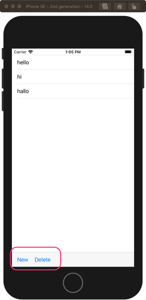
Followings are example for placing ToolbarItem with using .toolbar.
struct ContentView: View {
    let messages: [String] = ["hello", "hi", "hallo"]

    var body: some View {
      List(messages, id: \.self) { message in
        Text(message)
      }
      .toolbar {
        ToolbarItem(placement: .bottomBar) {
          Button("New") {print("new")}
        }
        ToolbarItem(placement: .bottomBar) {
          Button("Delete") { print("delete")}
        }
      }
    }
}
ToolbarItem
ToolbarItem is used to define the element which will be placed in NavigationBar and so on.
Here is the document from Apple.
For defining ToolbarItem, we need to specify two information.
- placement
- content
placement
“placement” is used to specify “where” item will be located.
It comes from two different context. One is “Semantics placement”. Another is “Positional placement”.
| specification | semantic/positional | location on iOS/iPadOS |
|---|---|---|
| .automatic | – | will be added at right-side of NavigationBar |
| .principal | semantic | will be added at center of NavigationBar. This will override NavigationTitle. |
| .navigation | positional | will be added at left-side of NavigationBar. might moved to .primaryAction location in case back button is already there |
| .primaryAction | semantic | will be added at right-side of NavigationBar |
| .status | semantic | will be added at center of bottom toolbar |
| .confirmationAction | semantic(modal interface) | will be added at .primaryAction location |
| .cencellationactioen | semantic(modal interface) | will be added at left-side of NavigationBar |
| .destructiveAction | semantic(modal interface) | will be added at right-side of NavigationBar |
| .navigationBarLeading | positional | will be added at left-side of NavigationBar |
| .navigationBarTrailing | positional | will be added at right-side of NavigationBar |
| .bottomBar | positional | will be added at bottom bar |
For “Semantics placement”, please refer to Apple’s document here.
Note: if specification will specify locations related to NavigationBar, need to use together with NavigationView. Otherwise toolbar will NOT appear.
# note: Reading SwiftUI header would help to understand 🙂
content
content is used to define content. i.e. UI element like Buttons will be created/passed here.
ToolbarItemGroup
It is troublesome to define similar element every time.
You can give placement specification effectively with using ToolbarItemGroup.
Defined placement for ToolbarItemGroup will be applied to each item which is defined under ToolbarItemGroup.
struct ContentView: View {
    let messages: [String] = ["hello", "hi", "hallo"]

    var body: some View {
      List(messages, id: \.self) { message in
        Text(message)
      }
      .toolbar {
        ToolbarItemGroup(placement: .bottomBar) { // (1) placement will be applied to all items (Buttons)
          Button("New") {print("new")}
          Button("Delete") { print("delete")}
        }
      }
    }
}
ToolbarContent
You can combine ToolbarItem with defining new struct which conforms to ToolbarContent.
Here is the document from Apple.
struct ContentView: View {
  let messages: [String] = ["hello", "hi", "hallo"]

  var body: some View {
    List(messages, id: \.self) { message in
      Text(message)
    }
    .toolbar {
      NewDeleteToolbar(new: {print("new")}, delete: {print("delete")})
    }
  }
}

struct NewDeleteToolbar: ToolbarContent {
  let new: () -> Void
  let delete: () -> Void

  var body: some ToolbarContent {
    ToolbarItem(placement: .bottomBar) { // (1) we can specify location for each ToolbarItem
      Button("New", action: new)
    }

    ToolbarItem(placement: .bottomBar) { // (2) we can specify location for each ToolbarItem
      Button("Delete", action: delete)
    }
  }
}
With using ToolbarContent, we can make ToolbarItem group even each Item has different placement specification.
Summary
For using .toolbar, here
toolbar を使ったコントロール等の表示には、以下がポイントとなります
- .toolbar is the view modifier to configure toolbar
- To define one element, use ToolbarItem
- For putting together, use ToolbarItemGroup
- For putting together different placement ToolbarItem, define and use new struct conforms to ToolbarContent protocol
SwiftUI本
SwiftUI で開発していくときに、ViewやLayoutのための適切なmodifierを探すのが大変です。
以下の”SwiftUI Views Mastery Bundle”という本がビジュアル的に確認して探せるので、超便利です。

Thank you for reading.
please feel free to contact me.
Sponsor Link

